Icon & Material Symbol styles
Material Symbols are the new default, and are available in three styles:
outlined
rounded
sharp
The legacy Material Icons continue to be available, but don’t have the variable font capabilities of Material Symbols.
Outlined style
Outlined symbols use stroke and fill attributes for a light, clean style that works well in dense UIs.
2dp outlined icons readable across sizes and applications
For optimal legibility and recognition, some symbols should remain filled, such as full body human icons or proprietary icons
The lighter stroke weight of these outlined symbols mirrors the thin lines of the app’s typography
Rounded and sharp styles
Rounded symbols use a corner radius that pairs well with brands that use heavier typography, curved logos, or circular elements to express their style.
Sharp symbols display corners with straight edges, for a crisp style that remains legible even at smaller scales. These rectangular shapes can support brand styles that aren’t well-reflected by rounded shapes.
Rounded-style icons
Sharp-style icons
This app uses rounded buttons and round icons
The 0dp corner radius of the sharp icon set echoes this app's rectangular design details
Customizing Symbols
Material Symbols have four adjustable stylistic variable font attributes called axes.
An axis is a typographic term referring to the attribute of a symbol that can be altered to create visual variations.
Each style symbol contains four axes:
weight
fill
grade
optical size
Weight
Weight defines the symbol’s stroke weight, with a range of weights between thin (100) and bold (700). Weight can also affect the overall size of the symbol.
Don't
Don't use the lightest weight(100) for standard-size (24dp) icons. The minimum weight for the size is 200.
Don't mix different weight
Caution
- Be careful using excessive weight for standard 24dp symbols
Do
- Apply weights consistently
fill
Fill gives you the ability to transition from a more outlined style to a reversed or more filled style.
A fill attribute can be used to convey a state of transition, such as unfilled and filled states. Values range from 0 to 1, with 1 being completely filled. Along with weight, fill is a primary attribute that impacts the overall look of a symbol.
Unfilled symbols with fill set to 0
Filled symbols with fill set to 1
Grade
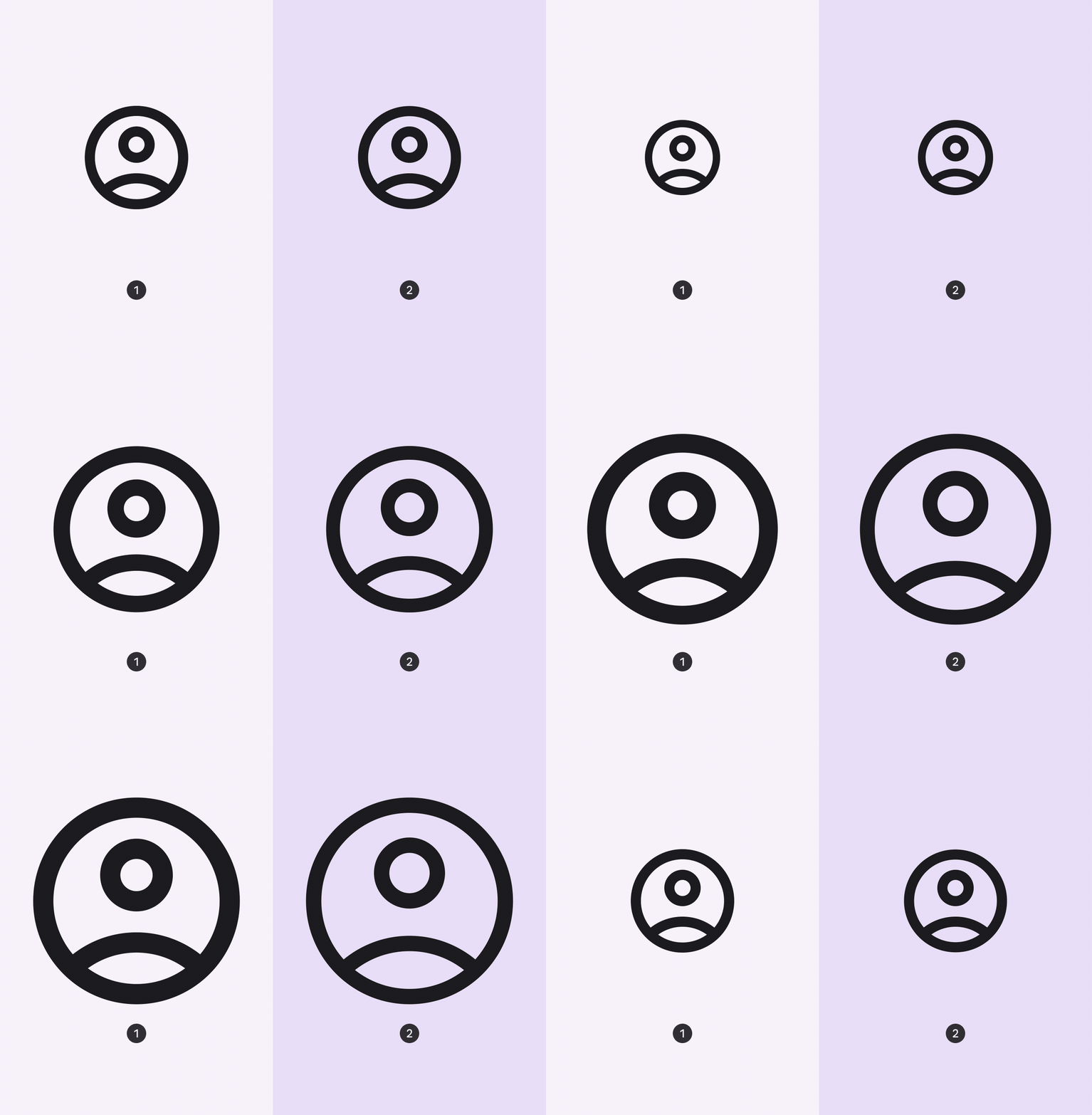
Weight and grade affect a symbol’s thickness. Adjustments to grade are more granular than adjustments to weight and have a smaller impact on the size of the symbol.
Grade is also available in some text fonts. Grade levels between text and symbols can be matched for a harmonious visual effect. For example, if the text font has a -25 grade value, the symbols can match it with a suitable value of -25.
At grade 0, the thickness of the symbol does not change
At negative grade, the thickness of the symbol appears lighter
Grade can also compensate for visual bleed, which is when images can look bigger or smaller depending on the color contrast.
To match the apparent icon size, the default grade for a dark icon on a light background is 0, and -25 for a light icon on a dark background.
Icon button featuring a 0 default grade symbol in light UI
Icon button featuring a negative grade symbol in dark UI
To make strokes heavier and more emphasized, use positive value grade, such as when representing an active icon state.
An icon with active state using positive value grade for emplhasis
Optical sizes
Optical sizes range from 20dp to 48dp.
For the image to look the same at different sizes, the stroke weight (thickness) changes as the icon size scales. Optical size offers a way to automatically adjust the stroke weight when you increase or decrease the symbol sizes
Four optical sizes, 20dp, 24dp, 40dp, 48dp
Traditionally, icons are resized from a 24dp source vector, resulting in a large scaled icon that’s too heavy compared to the original. With the optical size axis, you can maintain the stroke weight (thickness) as the icon size grows.

Material icon
Material Symbol
Use
Use 20dp optical size value for dense layouts on desktop
Use larger size 40dp~48dp symbols when primary actions need to be highlighted
Using symbols with typography
Pair your type with Material Symbols. Symbols are designed with similar considerations to typefaces, and often appear alongside text. Choosing the right icon set can tie the content of an interface together, enhancing the cohesive branded feel of your product.
Don't
Don't use the different weights for Material Symbols and text
Don't use the same baseline for Material Symbols and text
Do
Use the same weight for Material Symbols and Google Sans family text
Shift down the baseline of symbols to approximately 11.5% of the type size
Accessibility
icons with a label text
Label text provides short, meaningful descriptions when symbols are more abstract. This can prove helpful in the case of navigation.
Do
- Label text provides short descriptions, especially useful for navigation
Caution
- Use caution if icons are displayed without labels. Icon meaning should always be unambiguous and accessible for all users. Text labels can be omitted in specific circumstances where reduced visual impact is necessary.
Target size
Adequate space should surround icons to allow legibility and interaction.
Symbols of 24dp can use a target size of 48dp.
Clearance area
Placement
When a mouse and keyboard are the primary input methods, measurements may be condensed to accommodate denser layouts.
A 20dp size symbol can use a target size of 40dp.
Clearance area
Placement